Home Page
Use this screen to define home page configuration for different user languages, that are displayed in the external interface. The home page management screen is available in the Home Page module of the External Interface group.
This screen contains several widget for each languages, where localized content can be added.
Warning
Make sure to save your changes when you finish. The new configuration will be immediately deployed.
The following settings are available when adding or editing this resource. The fields marked with an asterisk are mandatory.
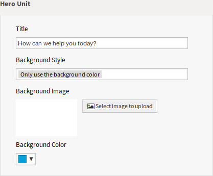
Hero Unit
This is the main widget of the external interface.
Hero Unit Widget
- Title
- This is the most important sentence or motto of the home page.
- Background Style
Define the behavior of background image and background color. The following options are available:
- Only use the background image
- Only use the background color
- Use the background image and overlay it with the selected color
- Background Image
- Select an image used as background image for the hero unit. To select an image, click on the Select image to upload button and chose an image from your file system.
- Background Color
- To change the background color, just select a new color from the color palette. You can chose from the pre-selected colors or define other colors by choosing it from the color selector or typing the hexadecimal value.
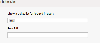
Ticket List
This widget is available only to logged in customer users. If the ticket list is enabled, the tickets of the customer users are displayed under the Hero Unit (search field). If the ticket list is disabled, the customer users can see the tickets only in the My Tickets screen.
Ticket List Widget
- Show a ticket list for logged in users
- This setting defines if the ticket list should be visible for logged in users or not.
- Row Title
- This is an optional title for the row, that contains this widget in the external interface.
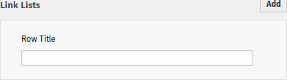
Link Lists
The link lists are displayed in a separate row in the external interface.
Link Lists Widget
- Row Title
- This is an optional title for the row, that contains this widget in the external interface.
You can add up to four link lists by clicking on the Add button in the top right corner of the widget.
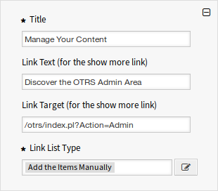
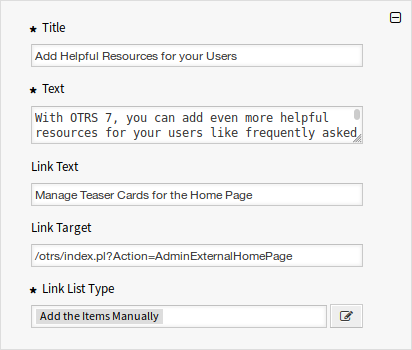
Link List
- Title *
- The heading text that are displayed in this item.
- Link Text
- Add the text for the show more link.
- Link Target
- Add the URL for the show more link.
- Link List Type *
Specifies the functionality how the item will be added.
- Add the Items Manually
Clicking on the edit button a new widget will be visible to add the items.
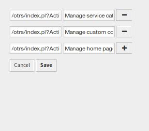
Add the Items Manually
- Show the Results of a Search
Clicking on the edit button a new widget will be visible to add the items.
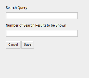
Show the Results of a Search
This configuration calls the document search. Therefore some tickets, FAQ articles, service catalog contents are necessary for this function. If the system has public or external contents, this card can show the elements.
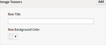
Content Cards
The link lists are displayed in a separate row in the external interface.
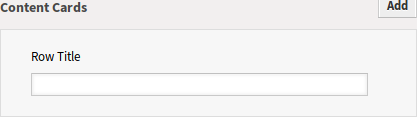
Content Cards Widget
- Row Title
- This is an optional title for the row, that contains this widget in the external interface.
You can add up to three content cards by clicking on the Add button in the top right corner of the widget.
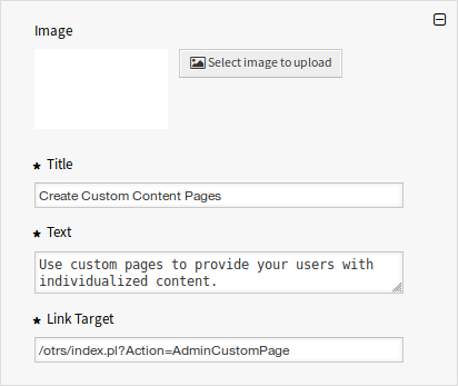
Content Card
- Title *
- The heading text that are displayed in this item.
- Text *
- The text for this item.
- Link Text
- Add the text for the show more link.
- Link Target
- An URL that will be opened after clicking on this item in the external interface.